

Flight Pro - White Icon Pack
Nate Wren Design
My first impression of Flight Pro - White Icon Pack was that it makes an Android home screen feel calmer almost immediately. The icons use a flat white style, and that consistency matters more than I expected: colorful app logos stop competing with the wallpaper, while the overall layout becomes easier to read at a glance. I tested it as a personalization app rather than treating it as a one-time decoration, because an icon pack only earns its place if the screen still feels good after the novelty wears off.
That distinction is important here. Flight Pro is aimed at people who want a deliberately quiet, minimalist setup, not users looking for animated effects, bright colors, or a dramatic themed interface. It comes from Nate Wren Design, a developer with a recognizable focus on Android customization, and it has built an average rating of 4.6 from around 1.7 thousand ratings. The app has passed 50 thousand installs, which suggests that its restrained look appeals to a specific audience rather than trying to suit everyone.
How the white icon style settles into everyday use
The strongest part of the experience is the visual discipline. A normal Android screen can become a patchwork of different shapes, colors, and brand styles. Flight Pro replaces that visual noise with white symbols that sit more quietly against the background. The result is especially effective when the home screen uses a dark, muted, or sky-themed wallpaper, because the icons remain visible without becoming the main event.
The first week is when the app makes its best argument. After applying the pack, I found myself noticing the wallpaper and spacing more than individual app branding. That can make a phone feel less busy, particularly if the home screen contains many shortcuts. It also works well for someone who checks the phone frequently but dislikes the small burst of visual stimulation that comes from a row of brightly colored icons.
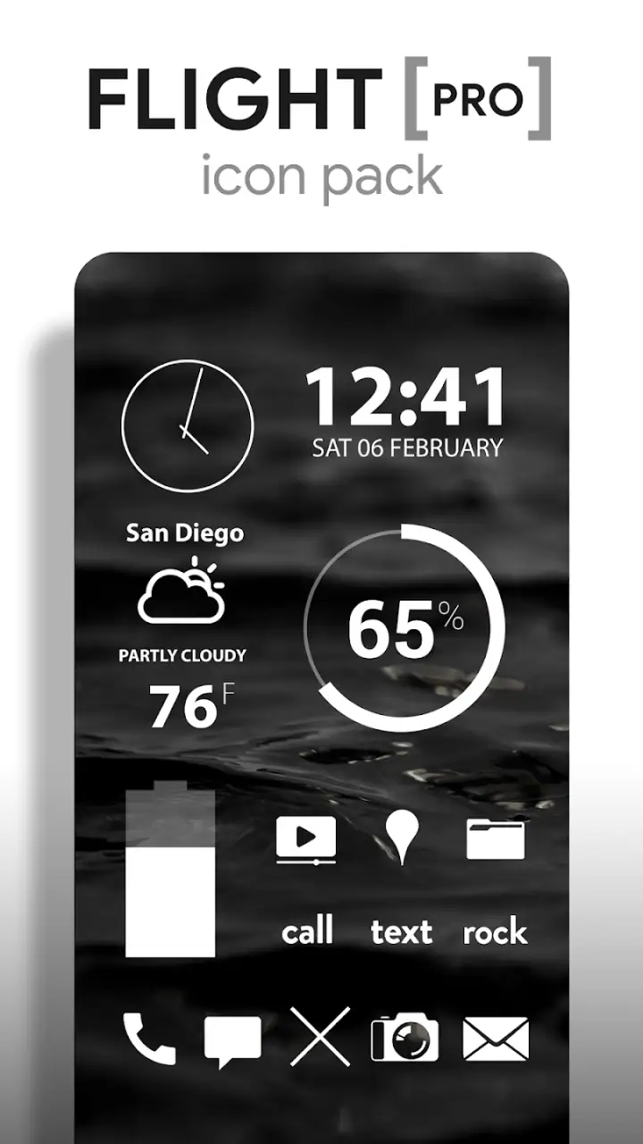
The included design direction goes beyond a simple collection of white replacements. Flight Pro contains more than six thousand icons, along with sky wallpapers and clock and weather widgets. That combination gives the setup a coherent starting point. Instead of hunting through separate wallpaper and widget apps, I could build a matching screen from one visual system, which is useful when the goal is a finished look rather than endless experimentation.
Related News

Why WhatsApp Messenger Still Makes Everyday Communication Feel Easy

Jurassic World: The Game Is the Better Dino Tycoon for Strategic Players

Threads in Real Life: Who Should Join, Lurk, or Leave

How SHEIN Turned Shopping Into an Endless Content Feed

How to Make Fortnite Feel Smarter on Mobile

Should You Switch to Microsoft Outlook on Mobile?
Still, a large icon library does not mean every app on a modern phone will necessarily receive the exact treatment I want. When an app is not covered, the launcher may show a generic fallback or retain the original icon, depending on the launcher and its support. That is one of the first things I would check before paying: think about the applications you use every day, not just the popular ones visible in promotional screenshots.
The app is rated for Everyone and requires Android 6.0 or later, so its compatibility range is broad enough for many Android users. It is listed at $2.49, with optional in-app purchases shown from $1.00 to $50.00 per item. I would treat the paid entry price as part of the decision rather than assuming that every customization element is included in the same way. The practical value depends on whether the core icon coverage matches your phone and launcher.
A realistic morning-to-evening setup
Imagine using a phone for work, messaging, banking, music, maps, and reading. With the default icons, each service announces itself through a different color. After applying Flight Pro, the same screen becomes more uniform. In the morning, a weather widget and a pale sky wallpaper can provide useful information without making the screen look like a dashboard. During the day, the white icons remain legible while the wallpaper stays in the background. At night, a darker background can make the arrangement feel more comfortable than a bright collection of logos.
Gallery
That is where the pack has genuine everyday value. It does not make a phone faster or add a new function to an existing app. Instead, it changes the emotional friction of opening the home screen. If you already prefer uncluttered desks, simple clothing, or low-distraction workspaces, this visual approach is likely to feel natural rather than forced.
The widgets also deserve a practical mention. A clock and weather display can reduce the number of times I open separate apps for basic information. The benefit is not that these are unusual tools; it is that their appearance belongs to the same visual language as the icons. A mismatched widget can undo the effect of a carefully themed home screen, so having coordinated options helps the design remain intentional.
What makes the first week appealing
The most noticeable improvement is not any single icon. It is the reduction of visual disagreement across the screen. Flight Pro is at its best when I use a limited number of home-screen pages, keep the wallpaper relatively calm, and avoid placing too many widgets on top of one another. In that setting, the white symbols create hierarchy: the wallpaper sets the mood, the widget provides information, and the icons become quiet controls.
There is also a useful psychological trade-off. A colorful icon is often easier to recognize through brand memory, while a monochrome icon is easier to fit into a consistent layout. I had to rely slightly more on position and shape after switching, but the screen looked more composed. People who organize apps into folders may find this transition easier because the folder names and placement provide additional orientation.
For a friend asking whether the app is worth trying, I would say the first-week appeal is strong if the visual goal is clear. I would not recommend buying it simply because a minimalist screenshot looks attractive. The style is quite specific. If you enjoy colorful icon packs, playful illustrations, or icons that stand out individually, the uniform white treatment may feel bland after the initial installation.
Whether it keeps earning space after the novelty fades
The month-to-month question is more demanding than the first-day question. An icon pack can look impressive for an evening and still become irritating when daily use exposes missing icons, awkward replacements, or a complicated update routine. Flight Pro has a better chance of lasting because its design is restrained. Minimalism usually ages more slowly than a trend built around loud gradients or novelty effects.
In my experience, the pack’s recurring value comes from consistency. Once the home screen is arranged around a neutral icon style, it becomes easier to change wallpapers without rebuilding the entire visual identity. The sky wallpapers provide a natural match, but I would not limit the pack to those backgrounds. Dark solid colors, muted photographs, and simple landscapes can also work, provided there is enough contrast for the white icons.
The large icon catalog is another reason it can remain useful. A small pack may look complete until I install a few less common applications. A broader catalog gives the theme more room to survive changes in my phone habits. That said, catalog size should not be confused with perfect coverage. The real test is whether the apps I add over time are represented well enough to avoid a distracting mixture of themed and unthemed symbols.
My practical advice is to create a short checklist before committing to the layout. Look at the apps on your first home page, the apps inside your most-used folders, and any work or school tools you open daily. If those icons fit the visual treatment, occasional gaps elsewhere will be easier to tolerate. If several essential apps remain visually out of place, the pack may never feel finished no matter how attractive the supported icons are.
Maintenance is manageable, but not invisible
Using a custom icon pack always adds a small maintenance habit. Launcher support matters, and applying an icon pack may require selecting it inside the launcher rather than simply opening the app and pressing one universal button. The exact workflow can differ between Android setups, so I would not expect identical behavior on every phone. This is not a flaw unique to Flight Pro, but it is part of the ownership experience.
When I install new apps, I also have to notice whether their icons match the theme. That creates a simple recurring decision: keep the new app on a secondary page, place it in a folder, or accept that one original icon will stand out. For someone who frequently changes phones, launchers, or home-screen layouts, this can become more work than the visual reward is worth.
The widgets introduce a second maintenance consideration. A clock or weather widget is useful only if it remains readable, correctly placed, and compatible with the rest of the layout. A widget that looked balanced on one wallpaper may feel too prominent after a background change. I found that keeping one information widget rather than filling the screen with several made the theme easier to live with and reduced the need for constant rearranging.
Updates can also affect the long-term experience. An icon pack is not finished just because it contains a large collection at installation. New applications and redesigned app logos create ongoing coverage challenges. I would check the app periodically rather than assuming that every future installation will automatically receive a matching icon. That small habit helps prevent the home screen from gradually becoming a mixture of styles.
Where fatigue can begin
The main source of fatigue is recognition. White icons look elegant, but they remove much of the color coding that helps me identify an app instantly. If I use many services with similar symbols, I may need an extra moment to read labels or remember positions. This is not a serious problem for a stable home screen, but it becomes noticeable when I reorganize frequently.
Another possible weakness is the fixedness of the concept. Flight Pro does one thing clearly: it turns the screen into a white, flat, minimalist environment. There is no need to wonder what the design is trying to be, but there is also little flexibility if my taste changes. After a few weeks, I might want a warmer color, more detailed artwork, or a set where each app retains more of its original personality. The pack cannot solve that preference shift because its strength is also its limitation.
Wallpaper choice can create fatigue as well. A sky image may look attractive in a preview but become distracting behind rows of icons, especially if the clouds or horizon sit directly beneath important shortcuts. I prefer backgrounds with open areas and moderate contrast. If the wallpaper is too bright, the white icons lose clarity; if it is too busy, the minimalist effect disappears.
There is also a cost consideration. At $2.49, the purchase is modest for a dedicated personalization tool, but it is still less sensible for someone who changes themes every few days. The optional purchase range reaching $50.00 per item makes it especially important to understand what I am buying before adding anything else. For a stable setup that I plan to keep, the initial price feels easier to justify than for a user who treats icon packs as disposable experiments.
How it compares with ordinary alternatives
The default Android icons are the easiest alternative because they require no setup and usually provide the fastest recognition. They are also inconsistent by design, since every app follows its own branding. I would stay with the defaults if I value convenience above appearance or if I often install unfamiliar apps and need their original colors to identify them quickly.
A launcher with built-in shape and color controls may be a better choice for someone who wants broad customization without committing to a single artwork style. That route can change icon size, spacing, and general appearance, but it may not deliver the same unified white look as a dedicated pack. Flight Pro is more focused: fewer design decisions, a stronger visual identity, and less freedom once the style is applied.
Other icon packs may suit users who want hand-drawn artwork, colored glyphs, or a more expressive theme. I would choose one of those if the personality of individual icons matters more to me than a calm screen. Flight Pro is the better fit when I want the home screen to recede and the layout to feel like one designed surface.
The useful trade-off is between control and coherence. Building a theme manually can produce a highly personal result, but it takes time and often leaves small inconsistencies. Flight Pro offers a faster route to a recognizable look, while accepting that the design is less individualized. For most people, that is the central choice—not whether white icons are objectively better, but whether consistency is worth giving up some app-by-app character.
Who should keep it, and who should move on
I would keep Flight Pro installed if I wanted a low-distraction Android home screen, used a compatible launcher, and preferred a stable layout over frequent redesigns. It is particularly suitable for people who like dark or muted wallpapers, organized folders, and a small number of carefully chosen widgets. The clock and weather elements make sense for a practical home screen rather than a purely decorative one.
I would be more cautious if my phone contains many niche applications, if I depend heavily on color recognition, or if I regularly switch between launchers. I would also skip it if I expect a theme to transform every screen of the operating system. An icon pack mainly changes the launcher experience; it does not automatically make every in-app interface match the same style.
Before buying, I would spend a few minutes looking at the current home screen and asking a simple question: will I still like seeing the same white symbols every day? If the answer is yes, the design has the kind of durability that matters. If I am mainly chasing the excitement of a new look, the appeal may fade as soon as the screen becomes familiar.
My long-term verdict
Flight Pro earns lasting space when I use it as part of a complete habit rather than as a novelty. The icons, wallpapers, and widgets work best together, with a restrained layout and enough empty space to let the white symbols breathe. Its strongest quality is not visual drama but the way it reduces the sense that every app is shouting for attention.
The compromises are real: launcher dependence, possible gaps in coverage, reduced color-based recognition, and a style that leaves little room for changing taste. None of those make it a poor app, but they mean the purchase is personal. I would not recommend it universally, and I would not install it on a phone where fast recognition and constant experimentation matter more than visual order.
For me, the fact that it is currently at version 3.9.5 and has been available since July 29, 2014, supports the impression of a product designed to remain part of an Android customization routine rather than a short-lived visual trick. The important test is still daily use: after the first attractive setup, do the icons remain comfortable to read and easy to live with?
My answer is yes, with conditions. If you want a quiet, white minimalist identity and are willing to spend a little time checking launcher compatibility and keeping the layout tidy, this is a convincing personalization purchase. If you want variety, expressive artwork, or zero maintenance, the default icons or a more flexible launcher will probably serve you better. The lasting value is in the calm it creates, not in the excitement of installing it.
FAQs for Flight Pro - White Icon Pack
What is Flight Pro - White Icon Pack?
Flight Pro - White Icon Pack is an Android customization app that replaces standard app icons with a clean, white, minimalist design. It is intended for users who want a consistent home-screen appearance, especially with dark, colorful, or simple wallpapers. The pack generally includes a large collection of themed icons, matching wallpapers, and support for applying icons through compatible launchers.
Which launchers are compatible with Flight Pro - White Icon Pack?
Compatibility depends on the launcher installed on your device. Flight Pro typically works with popular third-party launchers that support icon packs, such as Nova Launcher, Lawnchair, Action Launcher, Apex, Smart Launcher, and similar alternatives. Some stock Android launchers may not accept third-party icon packs directly, so you may need to use a compatible launcher before downloading or applying the icons.
How do I apply Flight Pro icons to my Android home screen?
After installing the pack, open Flight Pro and look for the apply option. Select your installed launcher from the list, then confirm the change. If your launcher is not detected, open its customization or icon settings and choose Flight Pro manually. Apps without a dedicated icon may remain unchanged or require the pack’s icon request feature, depending on the launcher and the developer’s available support.
Does Flight Pro - White Icon Pack include wallpapers and icons for every app?
The pack usually includes wallpapers designed to complement its white icon style, along with a broad selection of themed icons for popular applications. However, no icon pack can realistically cover every app, particularly newly released or less common ones. Unsupported icons may use automatic masking or an alternative style, while some launchers allow you to request missing icons from the developer.
Is Flight Pro - White Icon Pack free to use, and are there any limitations?
Availability and pricing can vary by store listing, region, promotions, or future updates, so check the current Google Play information before installing. Even when the app is free to download, full functionality may depend on using a compatible launcher. Users should also remember that it is an Android customization tool and is not designed for iPhone or iPad home-screen icon replacement.
Pros
- Clean white icons create a consistent
- minimalist home-screen style.
- Large icon library covers many popular apps and games.
- Includes alternative icon designs for greater customization.
- Cloud-based wallpapers complement the pack’s monochrome appearance.
- Simple dashboard makes applying icons on supported launchers straightforward.
Cons
- Some less popular apps may not have matching custom icons.
- Requires a compatible third-party launcher for full functionality.
- White icons can be difficult to see on very light wallpapers.
- Updates and new icon requests may not arrive frequently.
- Certain launcher features may require manual icon replacement.


